YouTube revamps its video player: a smoother, more immersive, and less cluttered interface
YouTube has announced a major redesign of its video player, aimed at making the experience more “immersive and visually pleasing.”
The changes, which were previously tested in limited trials earlier this year, are beginning to roll out this week across the web, mobile devices, and smart TVs.
YouTube: A cleaner, more immersive player
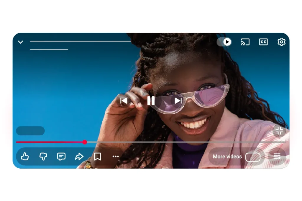
The platform describes its new player as “cleaner and smoother,” featuring redesigned icons, rounded buttons, and slight transparency on the on-screen controls. The goal is to allow the video to occupy more visual space while minimizing overlapping interface elements.
YouTube emphasizes that this update was designed to obscure content as little as possible, addressing a common complaint about the platform on smaller screens.
In short, the new player aims to fade into the background, letting the video take center stage.
A Modern and Less Intrusive Double-Tap
Another notable improvement is the iconic “double-tap to skip,” which now features a smoother animation. YouTube promises a “more modern and less intrusive” interaction, so it no longer disrupts playback when skipping ahead a few seconds. The transitions between tabs (videos, playlists, comments, etc.) have also been optimized on mobile for a more natural and quicker navigation experience.
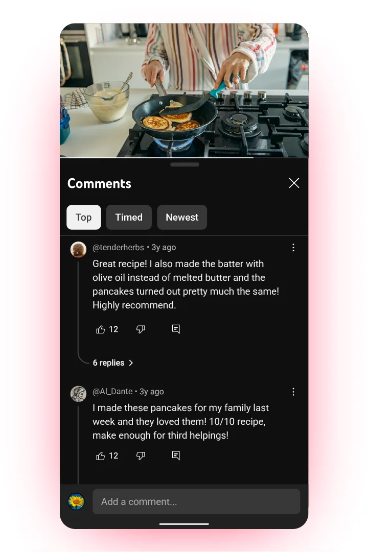
In terms of interaction, YouTube is introducing a better-organized reply system in comments. Discussions will now appear in structured threads, similar to Reddit, making it easier to follow exchanges between users.
This evolution aligns with a broader effort to clarify community interactions, especially on mobile, where reading responses has often been cumbersome.
Animated Likes and More Visual Playlist Management
YouTube is not stopping at the video player design. Three new features will enhance the user experience beyond just watching:
- Customized likes: for certain videos, the “like” button will display a dynamic animation. For example, a music note will appear when you like a music video.
- Improved playlist additions: the window for saving a video to a playlist or “Watch Later” has been simplified and made more visual.
- Interactive comments: the thread structure is now being rolled out globally after several months of testing on Android and iOS.
These changes are currently being rolled out globally. They will affect all devices, from smartphones to smart TVs and the web version. Beyond aesthetics, YouTube is clearly looking to refine the viewing experience—less distraction, more fluidity, and better-integrated interactions.
YouTube hasn’t revolutionized its interface, but this update moves in a positive direction: it makes the platform more enjoyable to use without altering its core elements. By adopting transparency effects and lighter animations, the service aligns with the current trend of “liquid” design popularized by Apple while staying true to its identity.
This subtle yet welcome refresh confirms YouTube’s commitment to gradually evolving the user experience, prioritizing visual comfort and immersion.

