Windows 11 tests a brand new, larger and more intuitive Start menu
Microsoft is experimenting with a major redesign of the Start menu in Windows 11, currently in testing within the Canary Channel of the Windows Insider program.
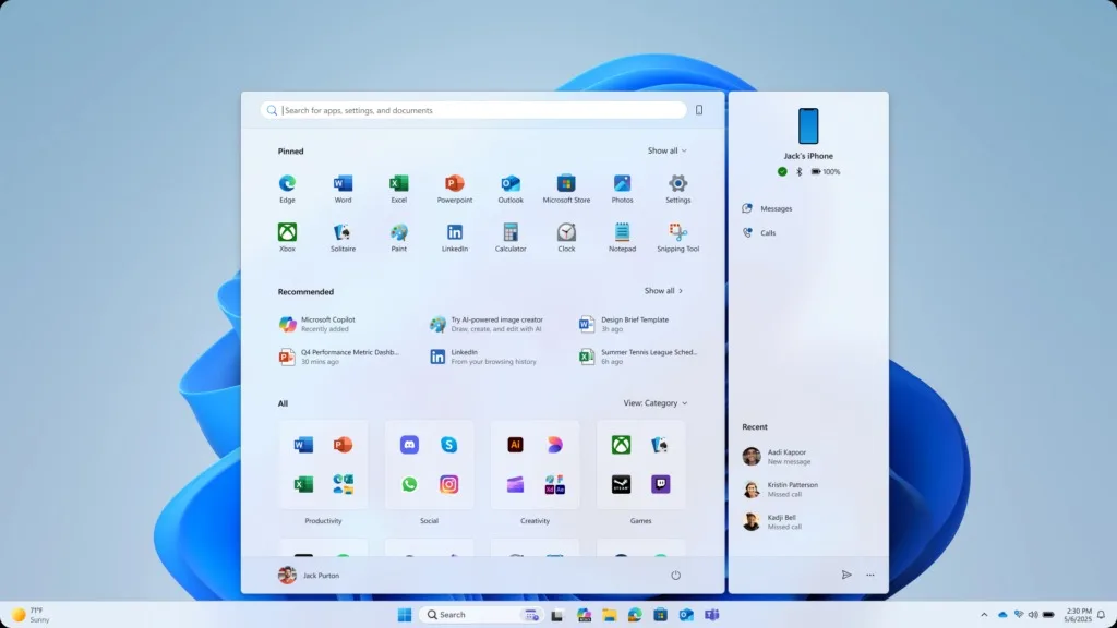
The new design, substantially larger than the current version, aims to reduce scrolling and unnecessary searches for quick access to applications.
Windows 11: A Redesigned Start Menu
The build 27965 of Windows 11, released in the Canary channel, introduces a new iteration of the redesigned Start menu. Microsoft explains in its release notes: “We’re making it easier to launch your apps with our updated, scrolling Start menu. The ‘All’ section now appears at the primary level, allowing easy access to all your applications without navigating through a secondary page.”
The company has also added two new display modes in the ‘All’ section:
- Category view, which automatically groups applications by type,
- and grid view, for a more compact and visual presentation.

A Design Inspired by the Past
This new menu appears to draw inspiration from both the full-screen menu of Windows 8 and the expanded menu of Windows 10.
It doesn’t take up the entire screen but utilizes more vertical space, better showcasing:
- pinned applications at the top,
- recommended files and applications in the center,
- and a comprehensive list of applications grouped by category at the bottom.

A connected Mobile sidebar remains available, displaying notifications, contacts, and the status of the connected smartphone. This can be toggled on or off using the phone-shaped button next to the search field.
Dynamic and Intelligent Categories
According to Microsoft, the category view automatically adapts to usage: “Applications are grouped by type for quick access to your most used categories and programs. If Outlook and Solitaire are your favorite apps, they will appear at the top of their respective categories.”
Categories only form if at least three applications belong to the same group; otherwise, they are placed in the ‘Others’ category.
Increased Customization
The new Start menu is also becoming more customizable with new settings in Windows.
Users can now choose to display or hide:
- recently added applications,
- most used apps,
- recommended files or websites,
- and shortcut, tip, or new application suggestions.
This is a positive development, even though the system still lacks the flexibility offered by third-party tools like Start11 or Open-Shell.
As is often the case, users will need to manually disable recommendations to avoid being bombarded with irrelevant app suggestions (no, Microsoft, no one wants to install LinkedIn).
Expected Gradual Rollout
Currently, this new Start menu is limited to the Canary Channel. It is expected to remain there for a few weeks to allow Microsoft to address bugs before a wider rollout to all Windows 11 users.
Although the redesign comes a bit late compared to the Windows 11 25H2 update, which is already being rolled out, it may be included in a future patch update (or possibly in 24H2 for some users).