Microsoft refreshes Office icons: smoother, more colorful, and inspired by Copilot
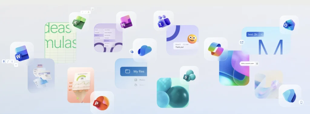
After being leaked earlier this year, Microsoft officially unveils this week the new visual identity of its Office suite. The ten essential applications of Microsoft 365 will adopt redesigned icons characterized by brighter colors, softer shapes, and a direct inspiration from the design of the Copilot icon.
A First Revamp Since 2018

This marks the first major redesign of the icons in six years. Jon Friedman, Vice President of Design and Research for Microsoft 365, explains that these new visuals aim to express “fluidity, connection, and accessibility,” concepts already present in the 2018 design guidelines but now taken further.
Microsoft has chosen richer and more contrasting color gradients to improve visual accessibility and enhance the playful aspect. The shapes are simplified; for instance, the Word icon has been reduced from four horizontal bars to three, making it clearer even at smaller sizes.

The company aimed to transition from “static solidity” to softer and more fluid shapes, with roundness symbolizing movement and friendliness.
Upcoming Deployment

These new icons will be visible in the coming weeks on the web, desktop, and mobile, for both individual and professional users of Microsoft 365.
An evolution that may seem subtle, but symbolically represents Office’s transition to a more modern, accessible identity centered on AI Copilot.