Google Maps and Photos adopt the new gradient logo
Since spring, Google has begun redefining the visual identity of its flagship applications, moving away from logos with four distinct colored sections (red, yellow, green, blue) in favor of a smooth gradient among these iconic colors.
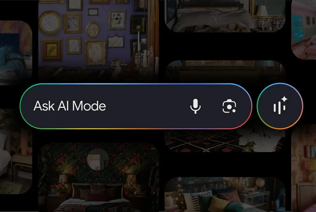
This new style, already visible in the Google app and on Gemini, now extends to Google Maps and Google Photos.
From Checked “G” to Bright Gradient
Last May, Google updated the logo of its main app — which previously displayed four distinct colors — to feature a new gradient “G”: the red blends into the yellow, the yellow into the green, and the green into the blue.
Two months later, the Gemini icon, formerly blue and purple, also adopted the four gradient shades, creating visual coherence across the Google ecosystem.
AI as the Driver behind This New Look
In September, Google explained the reasoning behind this redesign: “While maintaining our four iconic colors, the brighter shades and gradient design symbolize the momentum of innovation and the creative energy generated by AI across our products and technologies.” In short, these new visuals are meant to embody Google’s transition towards artificial intelligence, an era where the boundaries between the brand’s services blur in favor of a unified identity.
Google notes that it plans to extend this new style to more applications and platforms in the coming months.
Google Maps and Photos Now Adopt the Gradient
The two most used Google applications have also received their colorful makeover:
Google Maps:
- The icon remains a location pin, but the design is sleeker, larger, and more refined.
- The gradient replaces the sharply defined color areas.
- The single blue removes the previous multiple shades.
The result: a more elegant icon that aligns with the new visual identity.
Google Photos:
- The icon retains its four-blade windmill shape,
- but each blade now features a gradient from the inside to the outside, creating a sense of volume and light.
- The icon has also been slightly enlarged.
These new icons are already visible to some users, although full deployment has yet to reach all devices.
Which Apps Will Change Next?
According to several observers, Google is expected to soon apply this gradient style to other still “segmented” applications: Play Store, Chrome, and Google Calendar. These apps currently retain the four separate colors but will likely soon adopt smoother transitions between the shades.
This graphic evolution is significant as it marks the aesthetic unification of the Google ecosystem while symbolizing the fusion of creativity and technology, at the heart of the company’s AI strategy.
Personally, this new design conveys a genuine sense of coherence and motion. It modernizes Google’s image while preserving its historical chromatic DNA. A small logo change, but a major symbol of Google’s transformation in the AI era.