Google adopts a new gradient ‘G’ logo to reflect its shift towards AI
This marks the end of a graphic era for Google. Ten years after its last major redesign, Google has unveiled a completely new logo: a vibrant, multicolored gradient ‘G’ designed to represent the entire company beyond its flagship services like Search and Gmail.
Google: A smoother, brighter, more ‘AI’ G
The new gradient logo made its quiet debut on the Google Search app last May, appearing on Android, iOS, and even as a favicon on the web. It is now the official visual symbol of Google as a whole.
“The new ‘Google G’ now represents our entire company and visually reflects our evolution into the era of artificial intelligence,” explains Google.
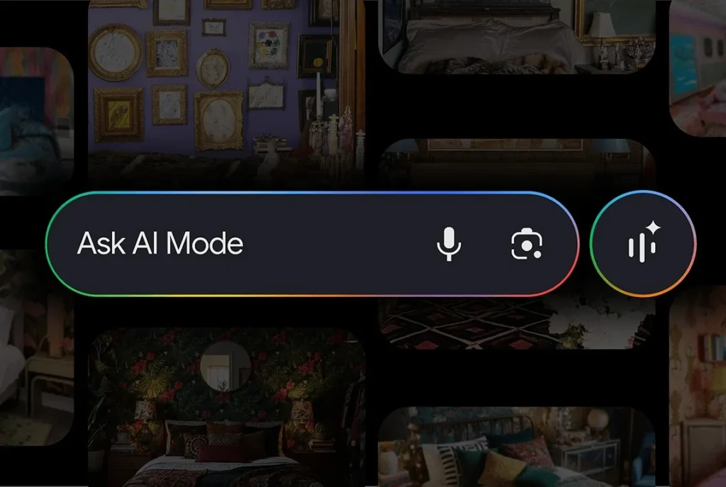
Unlike the previous segmented four-color logo (introduced in 2015), this new version features brighter colors blended into a continuous gradient. This choice aligns clearly with the visual identity of Gemini, Google’s suite of AI tools launched earlier this year.
![]()
A gradual change across all Google products
Google states that this new visual identity will be gradually rolled out over the coming months across all of its platforms and services.
Some products have already adopted this new style:
- The Google Search app icon
- The Google Home logo
- The Google Help support site, which already displays the updated favicon
Other services like Gmail, Google Drive, Google Meet, and Google Calendar should follow suit very soon.
Why this change now?
This shift is not merely aesthetic. It is part of a strategic overhaul of Google’s image as the company directs its development around generative artificial intelligence. With Gemini, Bard, Duet AI, and now AI integration in Android, Chrome, and Workspace, Google aims to unify its brand image under a logo that conveys creativity and innovation.
“This new design symbolizes the wave of innovation driven by AI across our products and technologies,” notes Google.
A logo designed for the post-Gemini era
This new ‘G’ also signifies a definitive move away from cooler palettes, such as the blue-violet previously used in Gemini. The company now speaks of “Gemini Spark,” a graphic spark representing its vision of AI. This new visual direction focuses on emotion, dynamism, and the unification of services.
A logo, a new era for Google
The transition to the gradient logo represents not just a change in style, but the beginning of a new chapter for Google. As AI becomes the central driver of innovation, this new logo aims to embody a brand that is more fluid, interconnected, and intelligent.
It remains to be seen how this harmonized visual identity will be received by users, particularly in light of the massive integration of Gemini into the Google ecosystem.